Responsive Web Design: Enhance Your Online Presence Today
Responsive web design is an approach that allows web pages to adjust their layout and content based on the device’s screen size. This ensures optimal viewing experiences across a range of devices, enhancing usability and accessibility. In this comprehensive guide, we’ll explore its definition, significance, and key components that can elevate your online presence.
Understanding Responsive Web Design
Responsive web design involves creating websites that provide an optimal viewing experience across different devices. It relies on fluid grids, flexible images, and media queries to adapt content to varying screen sizes. This is especially important as mobile browsing has surged in recent years; according to Statista, over 54% of global web traffic now comes from mobile devices.
The Importance of Responsive Design
With significant traffic coming from smartphones and tablets, having a responsive site is no longer optional. It’s critical for keeping users engaged. A non-responsive site can lead to high bounce rates, as users may leave out of frustration if content is hard to view or interact with.
Benefits of Responsive Design
Responsive design brings several key advantages:
- Improved User Experience: Users enjoy seamless navigation across devices.
- Boosted SEO: Google rewards mobile-friendly sites with higher rankings.
- Cost Efficiency: One website for all devices reduces maintenance costs.
- Faster Load Times: Optimized images and media queries can enhance site speed.
These benefits align directly with modern digital marketing strategies, making it essential for businesses seeking to enhance their online presence.
Enhanced User Engagement
Websites that employ responsive design often see higher satisfaction levels among users. A study by Google indicated that 61% of users are unlikely to return to a mobile site they had trouble accessing. This statistic emphasizes the need for an effective responsive strategy.
Key Components of Responsive Web Design
The foundational components of responsive web design include:
1. Fluid Grids
This design method uses percentages instead of fixed units (like pixels) to define widths. Thus, items resize dynamically and maintain proportion across different screens.
2. Flexible Images
These images resize within their containing elements. Proper use of CSS allows images to be contextually responsive, leading to optimized loading times.
3. Media Queries
This is a key technical feature allowing the website to adapt its layout based on the characteristics of the device viewing it. For instance, different styles can be applied to screens wider than 768 pixels vs smaller screens.
4. Breakpoints
These are defined points in the CSS where the design will change. Common breakpoints include widths of 480px, 768px, and 1024px to accommodate different device sizes.
How to Implement Responsive Web Design
Implementing responsive web design can be broken down into practical steps:
- Choose a Responsive Framework: Frameworks like Bootstrap and Foundation simplify laying out your responsive site with pre-designed grid systems.
- Use Media Queries Efficiently: Customize your CSS to include styles for various screen sizes, ensuring a tailored experience.
- Test Across Devices: Regularly test your website on different devices to ensure it maintains functionality and appearance.
With frameworks like Bootstrap, developers can quickly set up a responsive layout and easily implement modern UI components, ensuring consistency and design efficiency throughout.
Tools for Responsive Design
Several tools exist to aid in creating responsive websites:
- Google Mobile-Friendly Test: Evaluate your site’s responsiveness.
- BrowserStack: Test your site across on multiple devices and browsers.
- Adobe XD: Design responsive prototypes with ease.
- W3C Validator: Ensure your HTML and CSS code meets standard practices.
Testing Your Responsive Website
To ensure your responsive site is functioning correctly, consider these steps:
- Resize Your Browser Window: Observe how elements adjust and rearrange.
- Utilize Responsinator: A free tool to display how your site appears across different devices.
- Check Google’s Mobile-Friendly Test: This tool will provide feedback on layout and usability issues.

Common Challenges in Responsive Design
While the benefits are compelling, some common challenges include:
- Content Prioritization: Not all content translates well across devices; identifying what’s essential is key.
- Testing: Ensuring compatibility across numerous devices can be resource-consuming.
Discovering effective solutions often comes with experience and ongoing testing of designs.
The Future of Web Design
As technology evolves, responsive design is expected to grow in complexity and capability. The integration of artificial intelligence and machine learning may soon play a role in tracking user behavior, further enhancing personalized web experiences. Brands can capitalize on these technologies to develop notably refined digital projects.
Responsive Design Vs Adaptive Design
Both strategies adapt to various screen sizes, but responsive design fluidly adapts while adaptive design uses fixed layouts tailored for specific screen sizes. For instance, media queries dictate responsive design, while adaptive sites might run separate layouts for smartphones versus tablets.
What are the Key Features of Responsive Web Design?
Responsive web design encompasses flexible grids, fluid images, CSS media queries, and breakpoints to create adaptable website layouts that provide optimal user experiences.
Conclusion
Responsive web design is not just a design choice, but a necessity for businesses aiming to stay competitive in the digital landscape. Prioritizing a user-centric approach will lead to better engagement and ultimately drive conversions. Now is the time to enhance your web presence with a responsive website.
Contact us for a free consultation
Frequently Asked Questions
- What is responsive web design?
Responsive web design is an approach that ensures websites function well on various devices by adjusting layouts and content based on screen size.
- Why is responsive web design important?
It enhances user experience, lowers bounce rates, and is favored for SEO by search engines like Google.
- How does responsive web design work?
Through fluid grids, flexible images, and media queries, content adjusts dynamically based on the viewer’s device attributes.
- What are the benefits of responsive web design?
Benefits include improved user engagement, better SEO performance, cost savings, and easier maintenance.
- What tools are used for responsive web design?
Popular tools include Bootstrap, Adobe XD, Google Mobile-Friendly Test, and BrowserStack for comprehensive testing.
- How to test responsive web design?
Regular testing through resizing browser windows, using dedicated tools, and checking performance across devices ensures usability.
- What does a responsive web design look like?
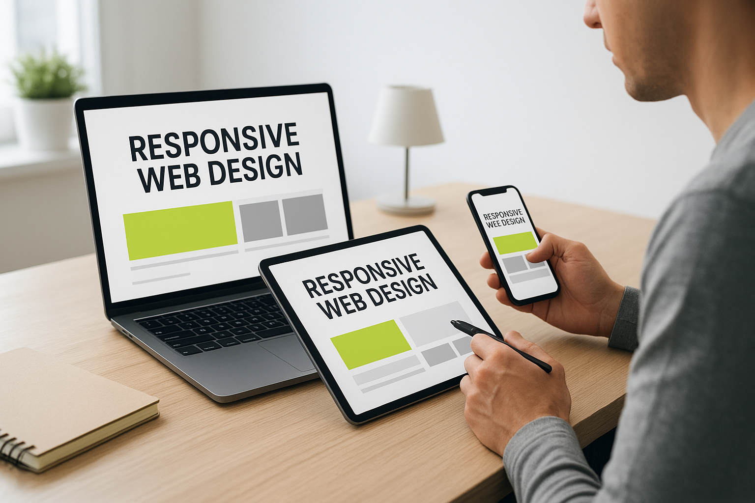
A responsive design reflows and rearranges content intuitively, maintaining usability whether viewed on a mobile device or desktop.