
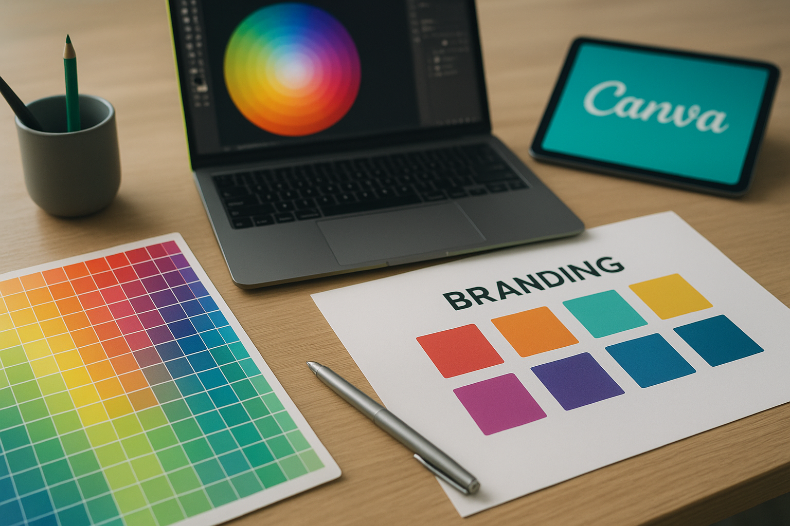
How to Choose Website Colors for Branding Effectively
Choosing the right colors for your website is essential for effective branding. It not only influences user perception but also plays a significant role in brand recognition and loyalty. This article explores how to choose website colors for branding by delving into color psychology, target audience considerations, and the creation of cohesive visual identities.
Understanding Color Psychology in Branding
Color psychology is the study of how colors affect perceptions and behaviors. Different colors can evoke specific emotions and associations in people. For example, blue is often linked to trust and professionalism, making it a popular choice for financial institutions and tech companies like IBM and PayPal. On the other hand, green is associated with growth and tranquility, which is why brands like Starbucks and Whole Foods incorporate it into their logos and websites.
Emotional Associations of Colors
Every color communicates something different:
- Red: urgency, excitement (e.g., Coca-Cola)
- Orange: enthusiasm, warmth (e.g., Fanta)
- Yellow: optimism, happiness (e.g., McDonald’s)
- Purple: luxury, creativity (e.g., Twitch)
- Black: sophistication, elegance (e.g., Chanel)
Understanding these associations is vital for creating an emotional connection with your audience.
The Role of Color in Brand Recognition
Brand recognition is crucial for establishing a memorable presence in the market. According to a study by University of Loyola, color increases brand recognition by up to 80%. Using consistent colors across your marketing materials can enhance brand recall.
Creating a Visual Identity with Color
When selecting colors for your website, consider how they reflect your brand’s personality. Brands like Nike use bold black and white to convey strength, while Ben & Jerry’s employs a vibrant and playful palette that resonates with a fun-loving audience. A cohesive visual identity helps users make a connection with your brand and reinforces your messaging.
How to Create a Cohesive Color Palette
Developing a color palette involves selecting primary and secondary colors, ensuring they harmonize with each other. Here’s how to approach it:
- Start with a Base Color: Choose a color that represents your brand.
- Complementary Colors: Select colors opposite on the color wheel to create contrast (e.g., blue and orange).
- Analogous Colors: Choose colors next to each other on the wheel for a more harmonious look (e.g., blue, blue-green).
- Consider Neutrals: Adding neutral colors can balance bright colors and improve readability.
Tools for Creating a Color Palette
There are various online tools to assist in creating a color palette:
- Adobe Color: An excellent tool for creating palettes based on color theory.
- Canva Palette Generator: Easy and user-friendly for quick color combinations.
- Coolors: Provides randomized palettes to inspire creativity.
Choosing Colors for Your Target Audience
Understanding your target audience is essential in selecting effective colors for your branding. Conduct surveys or focus groups to gain insights into color preferences among your audience. For instance, Houzz found that certain shades resonate more with homeowners, which impacted their design choices significantly.
Demographics and Color Preferences
Different demographics often have varied color preferences. For example, younger audiences may prefer vibrant, bold colors, while older consumers might favor muted, classic options. Tailoring your color choices to your demographic can significantly enhance your brand’s appeal.
Common Color Schemes and Their Meanings
Here are some effective color schemes and what they typically convey:
- Monochromatic: Variations of a single color evoke simplicity and elegance (e.g., shades of blue reflecting calmness).
- Analogous: A combination of colors that are next to each other creates harmony and unity (e.g., warm colors for a cozy feel).
- Complementary: Colors opposite on the wheel create vibrancy and contrast (e.g., blue and orange for a lively interaction).
Testing and Evaluating Your Color Choices
Before finalizing your color choices, it’s crucial to test them with your audience. Conduct A/B tests comparing different color schemes to see which performs better. I’ve found that even slight variations can significantly impact user engagement and conversion rates. Utilize tools like Google Optimize to run these tests.
Methods for Assessing Color Effectiveness
- Heatmaps: These can show where users click the most, helping to evaluate whether your color choices direct attention effectively.
- Surveys: Get feedback directly from users on their feelings about your website’s color scheme.
- Analytics: Track user behavior changes post-implementation to assess any positive impact.
Color Accessibility and Inclusivity in Branding
Creating an inclusive website means considering color accessibility for those with visual impairments. Adopting a color contrast ratio of at least 4.5:1 for regular text ensures readability for users with color blindness or low vision. Use online tools like the WebAIM Color Contrast Checker to evaluate your color pairs.
Tips for Accessible Color Choices
- Avoid relying solely on color to convey information (e.g., use labels or patterns alongside colored indicators).
- Use high contrast colors to make text readable against backgrounds.
- Test with users who have different disabilities to ensure your website is usable for everyone.
Top Tools for Selecting Branding Colors
Here’s a brief overview of some helpful tools to assist in choosing your branding colors:
- Adobe Color: Ideal for generating color palettes rooted in color theory.
- Canva Color Palette Generator: Simple interface for quick palette ideas.
- Coolors: Instant palette generation to spur creativity.
- Paletton: Great for experimenting with color schemes in real-time.

Conclusion
Choosing the right colors for your website can create a powerful impact on your branding strategy. By understanding color psychology, knowing your audience, and employing effective color schemes, you can forge deeper connections with users. Start testing your choices today and refine your visual identity for a stronger brand presence.
Frequently Asked Questions
What are the best colors for branding?
The best colors for branding often depend on the message and values of the brand. For instance, blue is commonly used in tech for trust, while green is frequently associated with health and wellness.
How does color affect branding?
Color significantly influences how brands are perceived. It can evoke emotions, create associations, and enhance recognition, ultimately affecting consumer decisions and loyalty.
Why is color important in branding?
Color enhances brand identity and recognition, and it can make a brand more relatable, helping to establish an emotional connection with consumers.
How to create a color palette for my brand?
Start with a base color representing your brand’s core values, select complementary and analogous colors, and ensure harmony and contrast to make it appealing.
What colors should I avoid for branding?
Avoid colors that could invoke negative emotions or associations related to your brand’s message. For example, red might be seen as aggressive in some contexts, while brown may convey dullness.
How can I test color palettes for my brand?
Employ A/B testing or focus groups to gather feedback on different color schemes. Analyzing user engagement data post-implementation provides valuable insights.
What is the impact of brand colors on consumer behavior?
Brand colors can significantly influence consumers’ perception of quality, effectiveness, and trustworthiness. Brands with consistent color schemes often have higher consumer loyalty.